Tuesday 10 May 2011
Other magazine
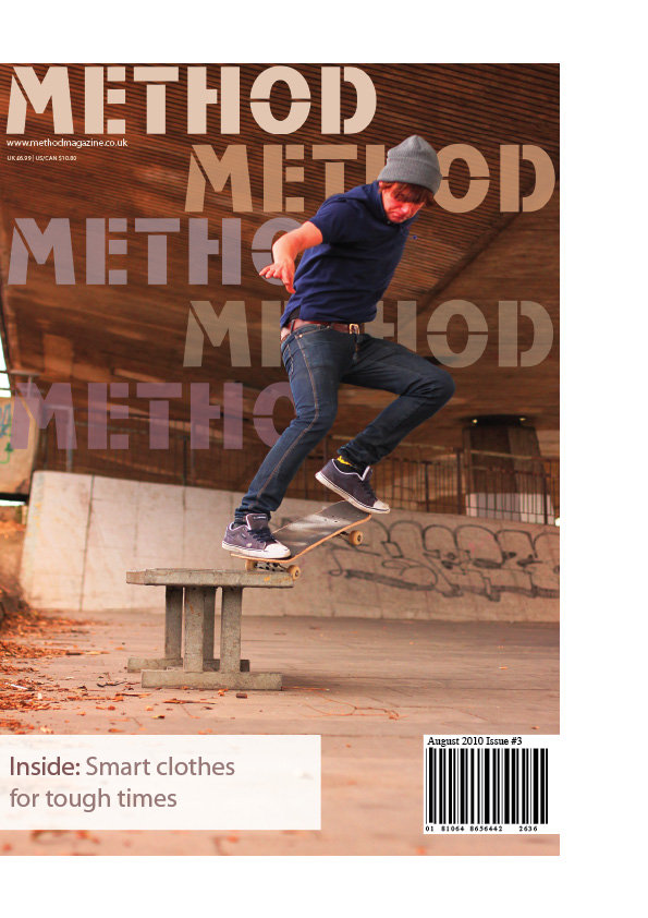
I really enjoyed the magazine project so i decided to design one of my own in a subject which i was interested in, so i decided to design a skateboarding magazine. I designed the front over and the double page spread as i thought it would be more interesting to do instead of a follow on page. When i designed the title i actually placed all the method logos under one another to see which one looked best and when i did it i thought it looked really good just having it like that. I chose the colours of the text from objects that are in the photo. so that they matched instead of having random colours like yellow and green etc.


Monday 9 May 2011
We were asked to design a logo for space bar which is a bar in the College area which is just for students 18 and over, I played around with some fonts and I created a logo which I thought would be suitable for the bar, then I thought it would be better if I got the 1st letter of space and create it into an actual logo on its own so that they could use it for other things like stamps and placed on t-shirts and had the word space bar underneath in a cool writing, I chose the colour blue mainly because when people relate space with colour it is normally blue. I also changed the colour of the font to orange as it is a complimentary colour and it makes it look more interesting.

Live Brief
We were asked to make a live brief for our next project. For my brief I made a leaflet for the bar that I work at which is North Bar near Central Station, before I started designing anything I asked the manager of the bar a series of questions to help me design the leaflet to his fitting, some of the questions included what style would you like the leaflet to be which he replied an urban like look. Also I asked what age range are we wanting to attract, his answer to that was from 18 to 30 as it is warm up area before The Cut which is also another popular bar for young people. I thought it would be good idea to take my camera out and take some photos of urban art work, as it started to get dark I took some photos just outside the bar, then I thought it would be a good idea to change the settings to slow shutter speed so when the cars went past it left a trail of light which I think would look interesting and different for a bar leaflet, I took a few photos like this so that I had a variety to choose from. A lot of them had too many lights and looked all over the place but there was a few with a good amount of lighting and a black area for the text to go.

Blue Bridge Logo
We were asked to create a new logo for Blue Bridge, these are some of the design which i have ended up with. The final one that i am most likely to pick is either the top left or the middle right as the top left even though the letters are very close together you are still able to see that is says B B. i really like the middle left but i thyink i may need to make some changes to it as it looks a little too much like the letter D until you actually read the blue bridge section.


magazine project
We were told to create a magazine double page spread and a follow on page. we all got given a certain subject,I l got PENSION AGE WORKERS ON THE RISE, so I did some research looking at a lot of different magazine pages. A lot of the interesting and different ones were mostly music magazines, they used a lot of different colours and they play around with the headers to make it more eye catching. There wasnt much I could put on the magazine so i tried making it colourful but not too colourful so that it was suitable for the target audience age which was around 30-80. I included some graphs and quotes to make it ;look more interesting and to keep the reader entertained.


Sunday 6 March 2011
Top 10 fonts


Chopin Script is a font which i have used many of times in passed projects as it can be used in various different things from titles of magazines to logos and also titles of books. Another thing that i like about it is that it is a fancy font yet it is easy to read unlike a lot of the Old English fonts around these days.

The reason i really like this font is because the use of the lines and the way the it looks like some parts have been scratched off as if it was like graffiti on a wall. The other thing that i like about this font is that it could be used for many different designs.

Tron is another one of my favourite fonts because of the way the letters look, some of the letters look fine then some of them have been slanted to the side to make it look abstract and a little bit futuristic. The font i think also looks very different to a lot of the fonts as some of them dont really look a lot like actual letters.
AD103 Visual Communication

For AD103 Visual Communication project we were asked to design a business card, Compliment sheet and a Letter head for one of the cafe/restaurants in newcastle college. We got the chance to have a look around at each of the restaurants in the college to look at the people that went there and to see what type of food and drinks they sold there. I picked Bistro as it looked like a nice restaurant where mostly young people tended to go as some of them were teachers only. I thought that a very simple yet effective design would be best suited with just two colours which include white a a light brown. I thought it would be a good idea on the business card to have the logo on the back in reverse to make the Bistro stand out a lot more. I feel that if i had more time i would of tried to find a slightly less boring font but i still think that this one works. What i enjoyed about this project was when we were able to look around the places that we would be designing for and having what was similar to a live client. What i disliked about the project was that it was difficult to find good restaurant business cards and compliment slips.


AD102 Techniques & Processes: Illustration

We were asked to create and final design book cover for either the Penguin book one hundred Years or the famous Puffin book James And The Giant Peach by Roald Dahl.
When i was researching children's books i noticed that a lot of the books were colourful paintings/drawings so i thought it would be a good idea to do a watercolour like image for the front and back cover. I drew the tree and peach separate, scanned them in and placed them in a good position. I was originally going to put a drawing of James on the cover but i feel that it is better not to have images of the characters as its more fun when people picture what they look like.
I hand wrote the title in a child like writing as it would make it more appealing to the children instead of some fancy or boring computer font. I thought that the blur looked more effective when text wrapped around the tree as it looked a little too boring when it wasn't. What i really enjoyed about this project was that i was able to use mix media and researching other old childrens books. What i disliked about it is that we were unable to choose our own personal puffin or penguin book.
Subscribe to:
Posts (Atom)